Obliged to be the go-between for several active agents –client, user, and producer–and for different ways of working, there has always been something ambiguous to the world of design. And even more so these days, when the binary fragmentations and dichotomies of the information age split up the space we share: north-south, global-local, underground-mainstream, material-immaterial… The work of Am I Collective is a fine example, if contradictory in its paradigm: a practice that points out and tears down supposedly hermetic borders, and whose worldwide success prompts us to rethink the importance of cutting crosswise, of work able to switchhit between manual and technological, vernacular and international.


 Vodafone. Diferentes diseños vectoriales para la agencia Yello Brands-Sidney, 2008
As a creative activity, one of the great qualities of design is its ambiguity; it is forever suspended between the opposite sides of one question, the two faces of a single coin. Partly, design is about strategy (because what it does has to coincide with the needs of industry) and partly about tactics (because its other role is to interpret contingent problems). So on the one hand design is concerned with non-physical things, the elaboration of abstract models, and working with systems, and on the other hand it is about taking ideas from elsewhere, making objects that break with convention, and doing what’s anomalous. Process and product. Innovation and tradition. Intuition and systematic thinking. Underground and mainstream. A game of opposites that could go on for a long time.
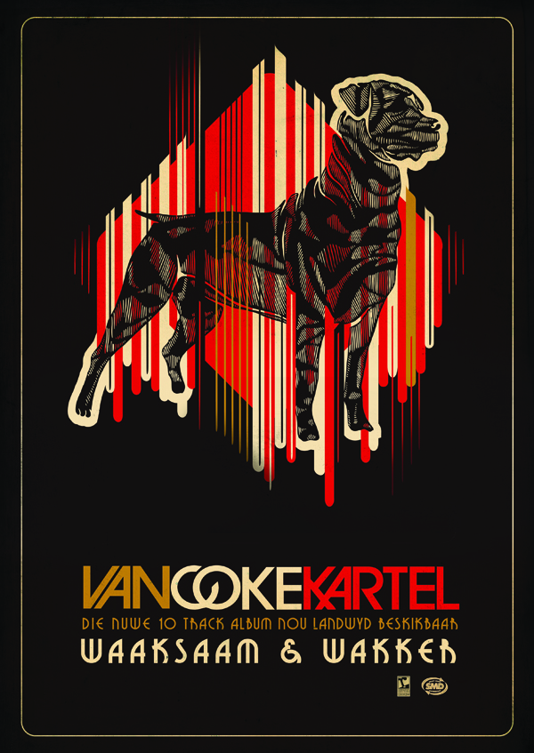 Van Coke Kartel. Dibujo vectorial, 2008
These ambiguities go deeper; they are embedded in the history of design. In 1850s London, a melting pot of events that were the inspiration of the time, the first great Universal Exhibition glorified the new concept of the industrially manufactured consumer product. The building in which these products were exhibited was itself an industrial design object, Joseph Paxton’s enormous glass palace. At the same time, the Victoria and Albert Museum was being established as a vast repository of the decorative arts, and product design was coming into its own; but even at that moment, the Arts and Crafts movement was advocating a return to artisan work.
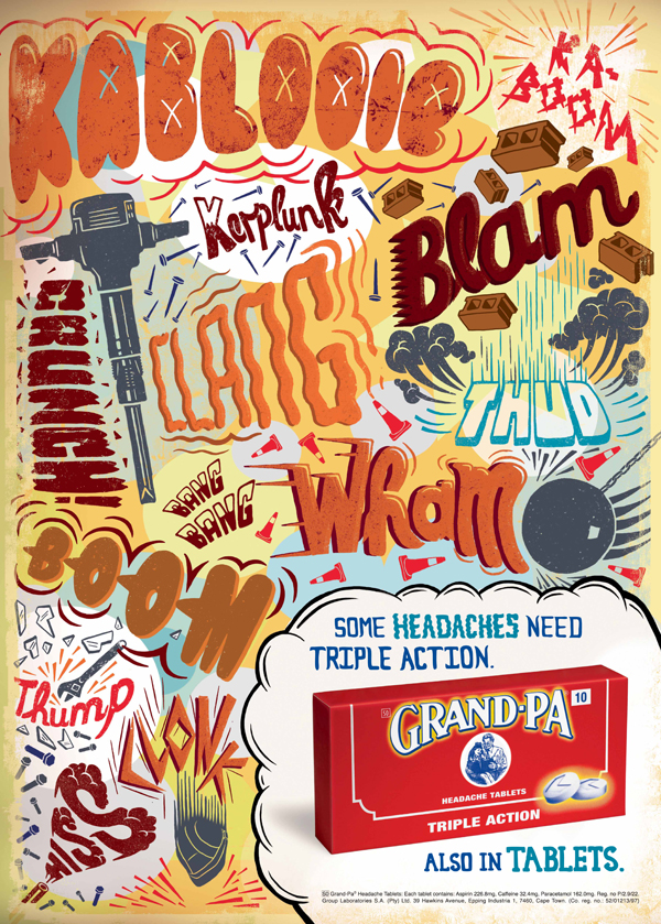
Grandpa. Dibujo a mano retocado realizado para Ogilvy, 2008
In somewhat generic terms, perhaps it could be said that any project for an industrial design product will be successful when it is able to take account of its own fundamental ambiguity: the extent to which it can mix two or more mutually exclusive ideas. Only then can it express the ability of design to work across disciplines, to define a problem from a different viewpoint; and at the end of that process, to address the need of the end user, or to put it better (since the marketing industry has itself taken up user-friendliness as one of its catchphrases), to be user-centred.
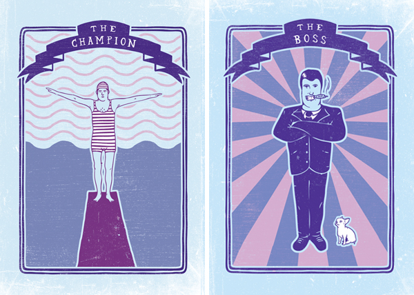
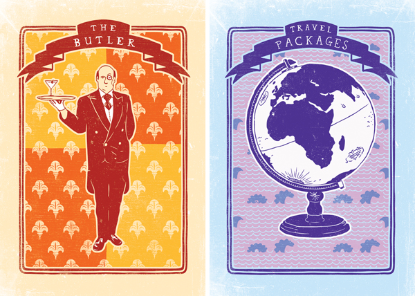
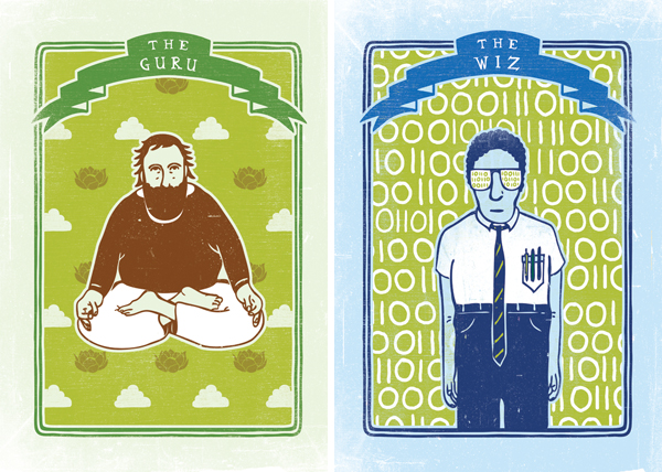 Horeca. Dibujos a mano retocados realizados para Oglivy, 2008
Thus, once again, design demonstrates its vital ambiguity. Design has to ally itself with business strategies, acting both as go-between and front man for the consumer products market, but also needing to address the expectations of the end user. Now that the PR industry has identified a form of end-user behaviour that can be turned into a marketing tool, the designer also deliberately encourages the end user, in a way that is carefully made to seem spontaneous, to customise a product (as the jargon has it), ignore the instruction manual, and “invent” personalised variations.
 Sasol-Inzalo. Técnica mixta para The Jupiter Drawing room, 2008.
Evidently, this places the product designer halfway between the end user and the client: needing to interpret the end user’s unvoiced need, or rather, to find ways of interacting with the end-user’s latent desires, whilst on the other hand going along with the needs of industry, whose role is to manufacture products economically. This ambiguous position is also a problem of methodology: the strategy of market hegemony pursued by business, versus the everyday ad-hoc activities of the end user. The designer cannot occupy only one of these spaces, but also, temporarily, has to occupy the other as well. These metaphors could go on and on.
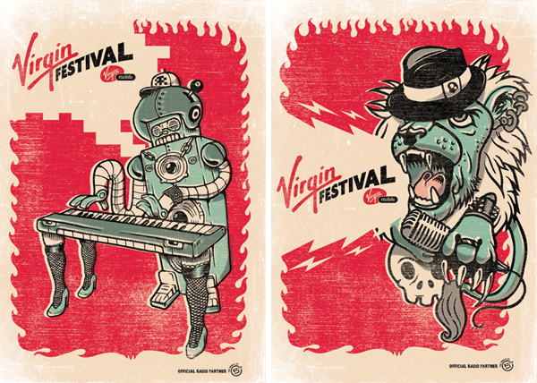
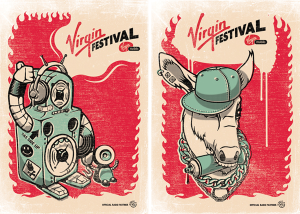 Virgin Festival. Diseños vectoriales y retocados para Virgin, 2008
But metaphors no longer apply when we turn to the relationship between globalisation and specific localities. Although the concept of “glocal” has now become hackneyed and commonplace, it can nevertheless still be seen as a typically dynamic theme in design: as representing everything that pertains to human culture in general. Some of the dynamics of globalisation were to a considerable extent already anticipated by colonialism; and some of today’s glittering new capital cities all over the planet (most notably in the Far East) were anticipated by an earlier colonial tradition that in some ways is still in the background, and in some ways is still an encumbrance.
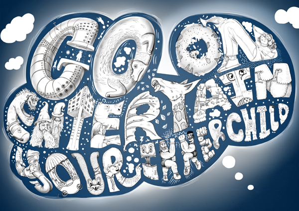 Thought Bubbles. Dibujo a mano retocado, 2008
In its own way, and in its many areas of pertinence, design has made itself the interpreter of these dialectics: in their furniture designs, Fernando and Humberto Campana use techniques and materials taken from the favelas, and then consigned to the world’s most elegant showrooms. And Ed Fella’s graphic design in Letters on America has an almost anthropological appearance; it points towards the vernacular graphic International Style of the Gigposters website, which brings together the posters of all the music clubs scattered all over the planet.
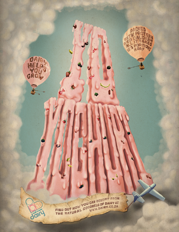 Dairy Board Yogurt. Dibujo a mano retocado realizado para FoxP2, 2009
The great success of the Am I Collective website is a result of having faced up to this ambiguity of design, and turned it into a resource. The success begins from what could be called the Am I Collective’s business set-up – that is, as a collective, working synergistically. It continues in the identification of stylistic and compositional elements that are still latent, because they are part of the subculture, and because they are strictly the work of particular artists, and which graphic design, because of its inherent reproducibility, is the first to deliver into the mainstream; and also because the Am I Collective has the ability to express the spirit of a particular locality (mainly by using a particular design language, not simply because of where they work) but which then becomes part of a globality: having a portfolio of clients scattered all over the world.
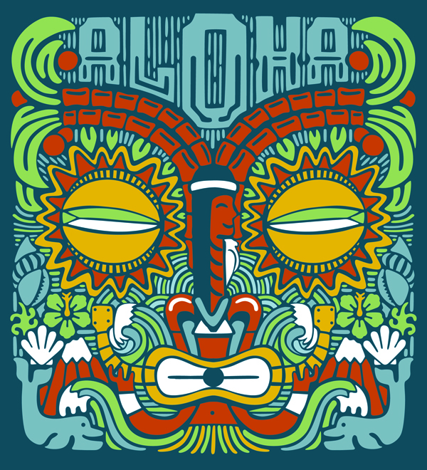 Ilustración realizada con técnica mixta para Y&R, 2008.
Above all, the emphasis in the Am I Collective’s method of working is on craft: working with the hands, producing hand-made artefacts – in an age of computer-generated illustration. Hand-drawn things intended for production in series, on a website where hand-drawn graphic illustrations sit side by side with the 3D animations created by the Collective’s sister organisation, Disko. At bottom, the lesson to be learned from the Am I Collective is that design is successful and works when it does not forget what it is. Indeed, when it faces up to all the challenges imposed on it by its own structure as a disciplined activity. Ambiguous.
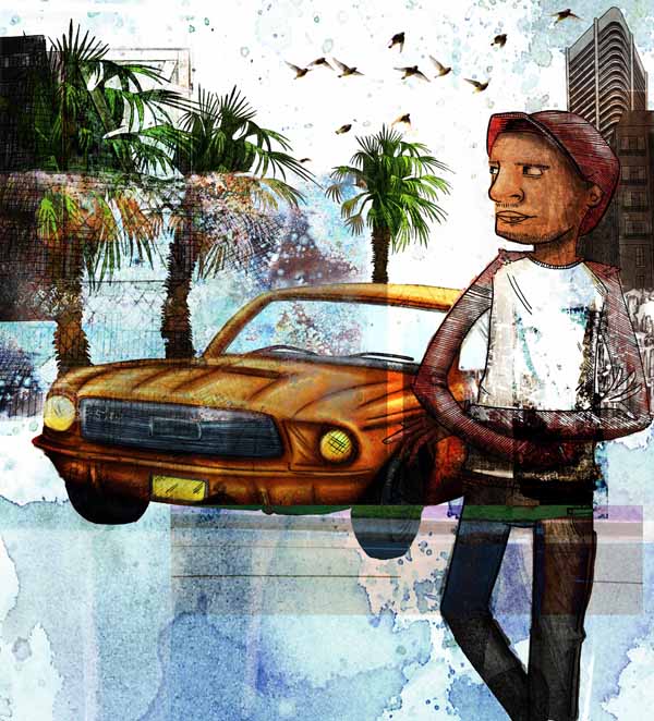 Ilustración realizada con técnica mixta para Y&R, 2008.
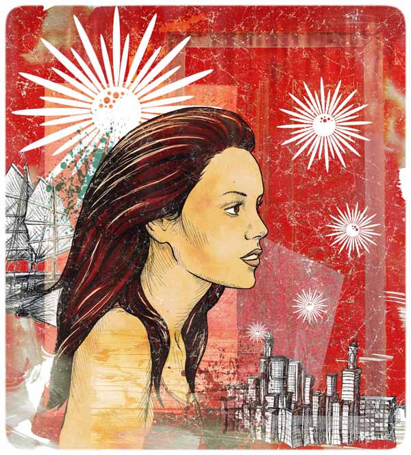 Ilustración realizada con técnica mixta para Y&R, 2008.
 Ilustración realizada con técnica mixta para Y&R, 2008.
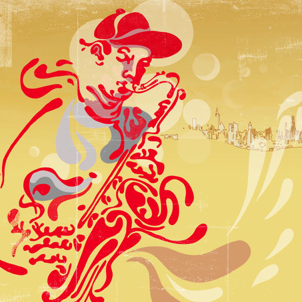 Ilustración realizada con técnica mixta para Y&R, 2008.
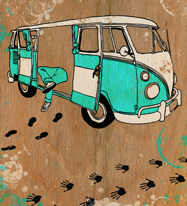 Ilustración realizada con técnica mixta para Y&R, 2008.
.jpg) Sasol-Inzalo, A new beginning, 2008.
Sasol-Inzalo, A new beginning, 2008.
Published in Experimenta 64, named Am I collective, Mass-produced hand-mades.





He estado explorando un poco para localizar artículos de alta calidad o bien publicaciones
de weblog en este tipo de espacio. Explorando en Yahoo por último me
topé con este lugar. Leyendo esta información, conque estoy satisfecho
de expresar que tengo una sensación extraña justísima, descubrí precisamente lo que precisaba.
Indudablemente, me aseguraré de no olvidar este lugar y echarle una ojeada de manera
constante. ¡Volveré, puesto que he marcado esta página como favorita y
lo he twitteado a mis seguidores!