François Caspar is driven by a creative exuberance. A designer with a vibrant eye, he uses a combination of practice, experience, functionality and communication to confront his work. For Caspar, a poster is a tool for linguistic research that has many levels of sophistication. Widely known for his defence of professional culture, his work stands out for its high-quality, its focus on the international scene, its pragmatism and its visual culture.
French poster tradition is so popular that the word affichis-me (and affiche, obviously) is used in many other linguistic regions. The reasons for this are readily identifiable. In the first place, the extraordinary juncture that was Art Nouveau: a concentrate of technological (lithography), aesthetic (the jilting of Western tradition) and social innovation (the Ville Lumière). In addition to Cassandre’s splendorous Art Deco; Savignac’s stylized imagery; the Eastern European School’s links with the world of posters, which became apparent in the work of its emigrants (including Tomaszewsky and Cieslewicz); and, finally, the public character of graphic design (celebrated in a large exhibition held at the Beaubourg in 1984), whose leading characters included groups such as Gapus and individual artists like Michel Bouvet.
Establishing a dialogue with such a rich tradition does not seem to pose a problem for François Caspar. The efficiency of his work is not disturbed by the natural attempt to place it within the folds of this tradition. First, it is necessary to put Caspar’s professional trajectory in context. For him, as for many other designers, a poster can be a personal tool for linguistic research, be it because it is a sophisticated medium, addressed to a public with specific competences (as in the case of theatre posters, for instance), or because it is based on a particularly incisive approach, as in social communication. But, naturally, we cannot justify this French designer’s attention to posters based on a specific type of public alone; indeed, it remains unchanged in products designed for different targets, as in carnival or rock concert posters.
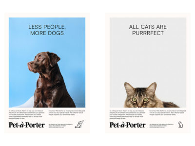
Rather, we should look to this author’s professional experience, accumulated over twenty years of work, as well as to his diverse range of clients and fields of intervention. We should also observe the fact that these posters can be elements of a changing identity: the series of posters for the Théâtre de la Tête Noire, a coordinated image based on a design idea of business-style (rather than visual style) cut; somewhat similar to what Paula Scher does for the Public Theater. In the case of Caspar, another noteworthy feature is his involvement in furthering the profession from his present post as President of the French Designers Alliance, of which he is a founding member: a multi-disciplinary professional association set up after the experience of the Syndicat National des Graphistes had worn thin, and whose name already makes reference to other concepts of the trade.
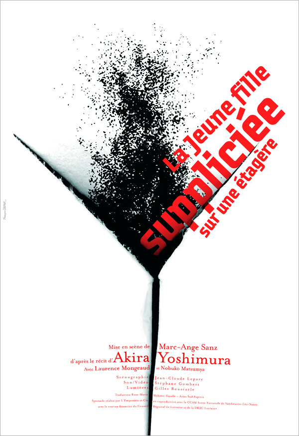
The girl tortured on a rack. L'Empreinte et Compagnie, 2005.
Caspar, then, is a figure known in international circles not only for his participation in biennials and conferences around the globe, but also for his capacity to establish relations with professionals and associations the world over, without these being marred by individualist attitudes, marked instead by the principles of a designer, and an excellent one at that, whose aim has always been to advance professional culture, starting in his own country. We are speaking, then, of high-quality design, an awareness of the international scene, a healthy pragmatism and, finally, and this is evident in his production, an outstanding image culture.
Thus we arrive at the roots of Caspar’s style. By style—and we repeat this for the hundredth time—we refer to different ways not of using shapes and colours, but of tackling problems. The point is that to this day, even after twenty years of professional activity, François shies away from preconceived formulas. He steers clear of stylemes, trademarks, pre-established iconographies, habitual techniques and other such resources. He designs as if the poster on which he is working was the last… or the first. We are exaggerating, of course, because one cannot stop feeling the vibration of common registers in the posters that make up a series (the ones designed for the Théâtre de la Tête Noire, already mentioned above, or those for the Forum of Human Rights). Not keeping these registers would be a waste. However, nobody can deny the fact that Caspar has a creative exuberance. Though, authentic designer that he is, in Casper’s case this creative exuberance stems from the practice, experience and functionality of communication.
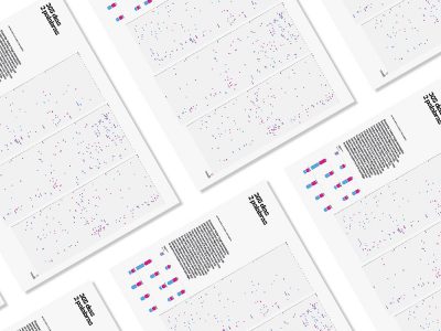
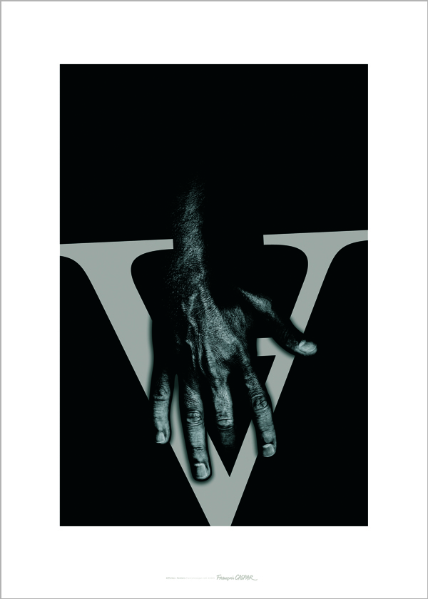 A Love Letter. New Year Self-promotion poster, 2005.
Published in Experimenta 57.

